Today is the day when we need to stop using this on our websites.
Probably you didn't even see this, but it exists. You just don't click on it.
For those who don't know what I'm talking about, I'm here with an example.
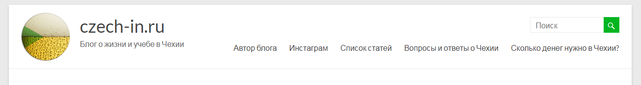
On my second blog I have a header menu:
However, on the mobile devices people see that strange thing instead:
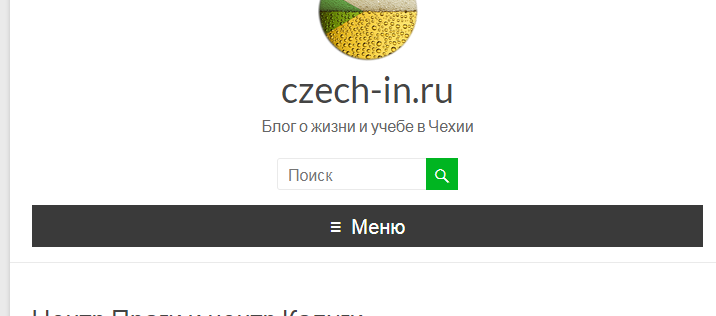
When I've installed this theme, I was wondering, does anyone really click on it? Yes, my audience mostly consists of young people, however I myself wouldn't ever click it, so this stays hidden for me, thus it's useless.
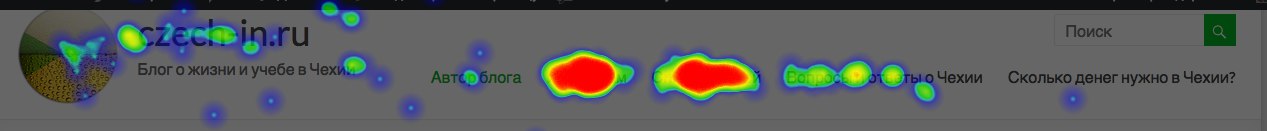
So I thought — why don't I apply some analytics? Here's the result:
Here's a heatmap of the clicks people made during 1 year on a full-width menu:
and here's the same, but on mobile:
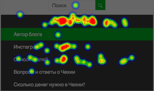
As you see, people use my menu a lot less, whenever they have to
- a) make 1 more click
- b) understand, what the fuck is this strange menu icon.
Actually, it causes a lot of problems, as I tend to put the most necessary pages into my menu section. Mobile users' number is growing, but there's no good way to optimize the menus still.
I suggest making the step # 1 ASAP — stop using the hamburger buttons on mobile versions of your websites.